Landmark
Overview
The main purpose for this project is to conduct user research and identify pain points for improvement on Landmark's UX and UI design. We developed actionable solutions to address business problems such as high bounce rates on the landing page and low conversion rates for online ticket sales.
Key methods used include in-person user testing, SUS questionnaire, joint observations to prove or disprove hypotheses and make design decisions accordingly.
Role
UX Researcher
UX & UI Designer
Tools
Figma
Google Sheet
Zoom
Deliverables
User Testing Report
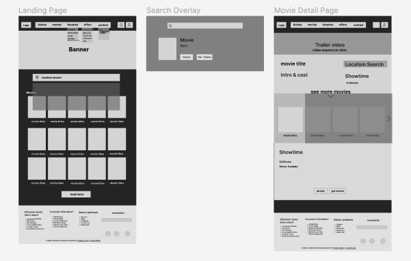
Wireframes
Mid-fi Prototype
 Problems & Findings
Identifying Potential Problems
Landmark is Canada's second largest motion picture theatre exhibition company, and is known for its recliner seats. However, we've noticed that the overall UX experience on the website has room for improvement. Thus, we decided to conduct user tests to get below hypotheses proven or disproven, which leads to further design solutions.
1. The large amount of options in the main navigation would overwhelm users' cognitive load, and would hinder their ability to reach their goal efficiently.
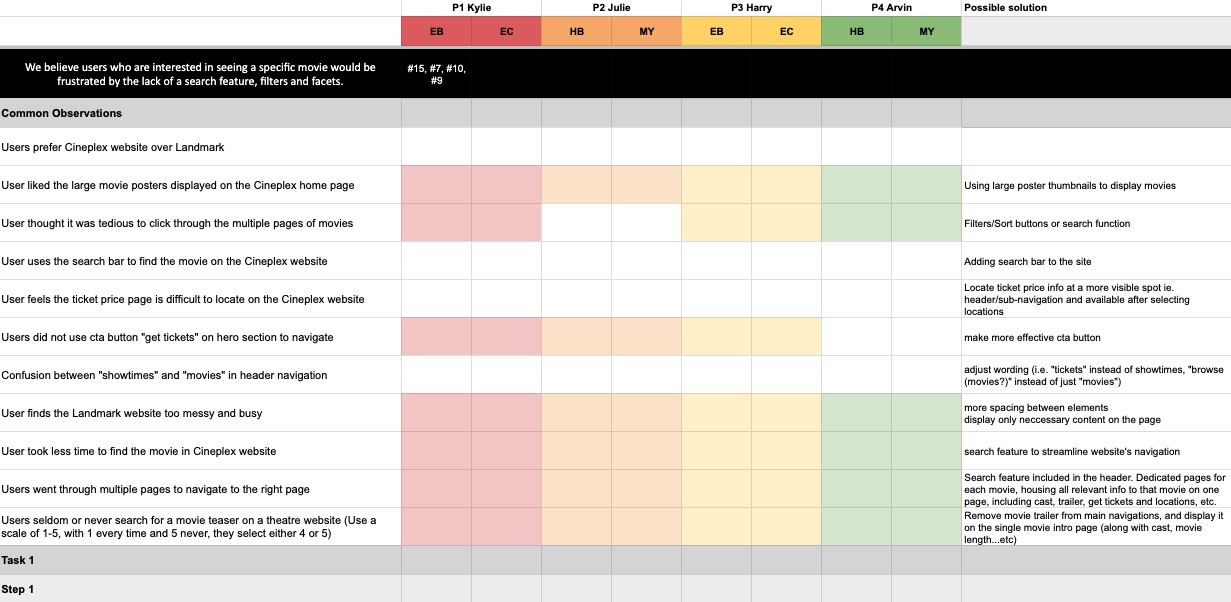
2. Users who are interested in seeing a specific movie would be frustrated by the lack of a search feature, filters, and facets.
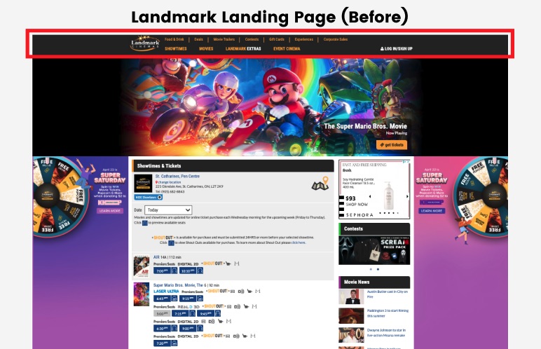
3. The “showtimes & tickets” section is cluttered, which might lead to people leaving the website without selecting a movie.
Moderated User Test with Follow-up Questionaire and Observations
There were 4 participants selected among 13 people after completing the screening survey. Each of them has different occupation, age and preferance for cinemas.
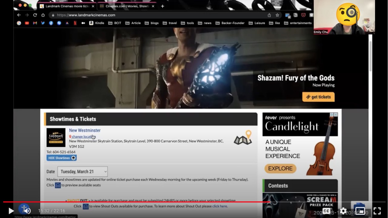
Moderated, in-person testing was conducted for the user studies, which were simultaneously being recorded via Zoom. Moderators followed tasks cards that were created ahead of time, to guide participants through a series of tasks and questions relating to the Landmark website.
There were 3 tasks given to the participants, which covered blink test, searching for a specific movie, finding information such as tickets, pricing, showtimes, and location, as well as navigating the website using the primary navigation within a limited timeframe.
At the end of the study, users were asked to complete a SUS (System Usability Scale) questionnaire about the website.
Following each session, each user's recording was viewed by 2 observers who took notes about the study, and common observations were highlighted.
Users Find It Difficult to Navigate Through the Site and Look for Specific Movie
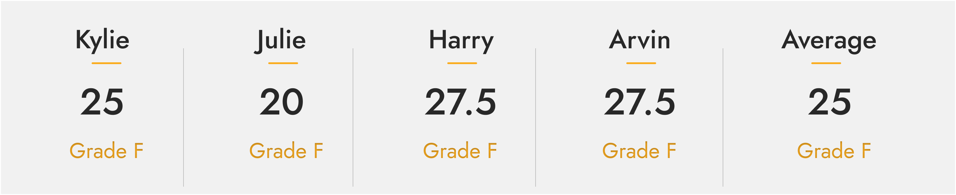
According to the SUS completed by the participants, the majority reported poor experience on Landmark website with an average score of 25.
Based on the observations and analysis, we concluded below findings for further UX and UI improvements, which also had our hypotheses proven:
- Landmark website was difficult to navigate due to the unclear navigation labels and organization of content.
- Users had difficulties finding the specific movie and setting location with drop down menu.
- Landmark website was cluttered and overwhelming, making it challenging for users to view available movies.
Conclusion
Solutions
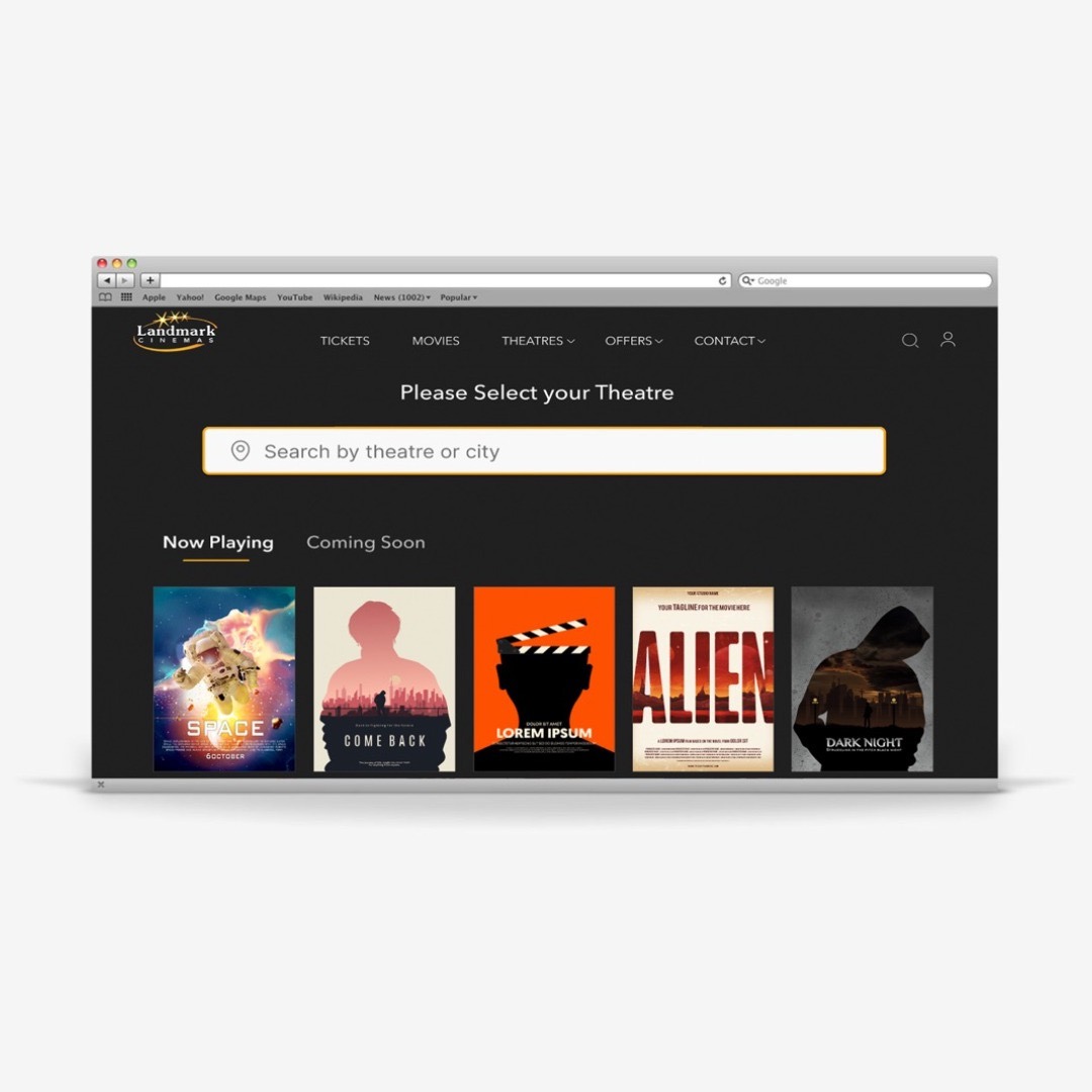
- Simplifying main navigation and using dropdown menus to indicate information hierarchy
- Including search feature for both movie and location to allow accessible and intuitive navigation
- De-clutter ticket purchasing process to improve user experience
Conclusion
Our user studies of the Landmark website has revealed significant issues with search and navigation, information architecture, and categorization, all contributing to an overall cluttered user interface. These challenges resulted in confusion for our test participants, hindering them from completing primary tasks.
Meanwhile, it has revealed the critical importance of understanding users' needs, as well as building clear navigation and streamlined information architecture.
Moving forward, our focus shifts to bringing the prototype to life and conducting rigorous usability testing. Through this iterative process, we'll closely observe how users engage with the design, gathering valuable insights that will guide us in refining and enhancing the user experience.

Resources
Original Website: Landmark
Movie Posters on Wireframes: Adobe Stock (Education licensed)