worKO
Overview
worKO is a coworking space app, which provides a platform to connect space owners and people with need for diverse occasions. The brand is named based on the idea of “work + KO”, meaning completing all the work.
The usability test aims to know if registered users can successfully log into the app with email, browse and save the spots they're eyeing on and make reservations.
Role
UX & UI Designer
Tools
Figma
Maze
Adobe Illustrator
Deliverables
Persona
User flow
Wireframes
Prototype
Usability Test
 Analysis & Design
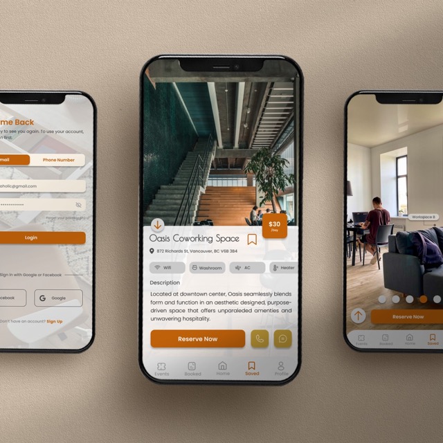
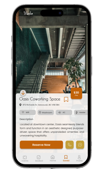
Diverse choices with Easy Access to Details
worKO targets users that seek for flexibility of time and space, while also pursue quality of the environment.
To fulfill the needs from users, worKO was designed based on the concept of easy access to details of the space, including facilities, images for interior design and overall atmosphere.
If users have any questions for the space, they can also get in touch with the space owner easily.
Clear Navigation and Intuitive Design
The flowchart was designed based on three tasks for usability testing, including:
- Login to account with email
- Saving a spot
- Make reservations
To enhance accessibility, users can either save the spot on thumbnail or in the detail page. They can also unsave it in few clicks.
I also merge the viewing for facilities and images, as well as contact buttons into one screen, so users can quickly reach their goal and move on to the next step at ease.

Usability Test
Unmoderated and Remote Test by Maze
For usability test, I conducted it unmoderatedly by the 3rd party online tool Maze, by which there was no live observer present. Every participant was remotely using desktop to complete the assigned tasks.
There were 9 participants with 9 responses received for the test.
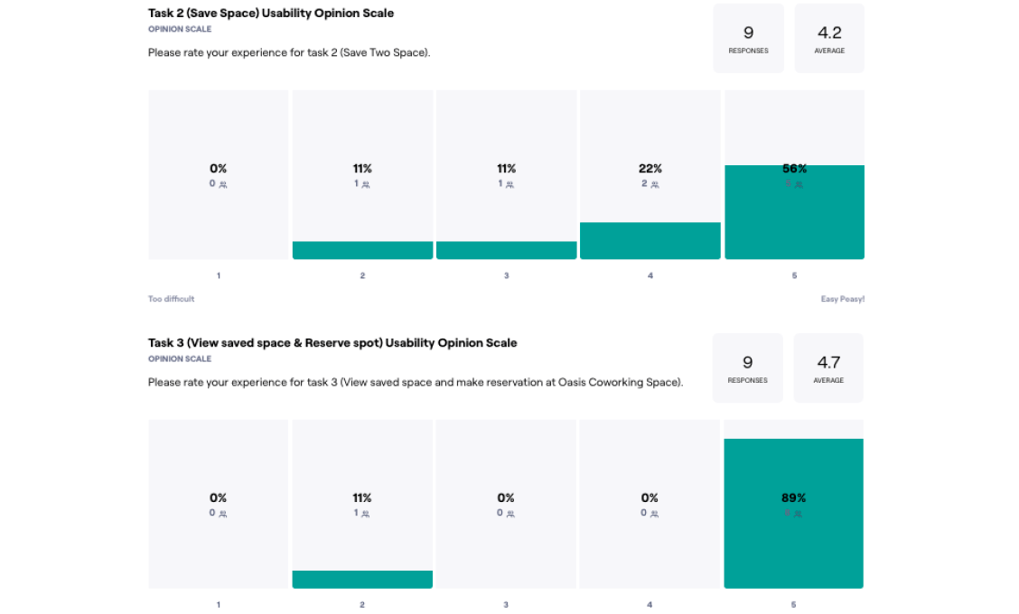
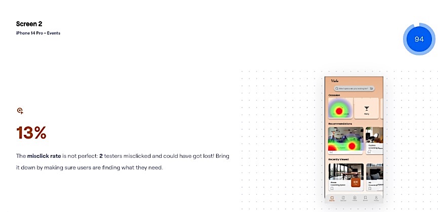
Higher Mis-click Rate on Spot Saving Process
Based on the post-session questions, 9 out of 9 participants had no issues with the first task, which was login to the account with email. However, issues occur for task 2 (saving the spots) and task 3 (reserving space.)
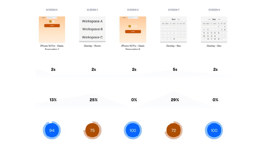
According to the steps breakdown, we could observe that mis-click rate increased while participants were asked to finish the goal by clicking smaller area such as buttons or a date on the calendar.
Task 2 had highest mis-click rate, with average mis-click rate of 56.9%, and 7.7% for each screen.
Challenges
Visibility and Effectiveness of Buttons
Bookmark element and call-to-action buttons are uneasy to be clicked on. Through usability test, it was found that the bookmark icon on the thumbnail had higher mis-click rate.
Some participants thought the bookmark wasn't responsive after failing several clicks, and thus were unable to proceed the task.
Clarity of Step Indicator
The step indicator in reservation process was misleading, as participant thought it was indicating the quantity of guests.
The way it presented was also not common for users to recognized, which resulted in decreased usability.

Conclusion
Increase Accessibility of Buttons
- Enlarge size for both font, bookmark icons and overlay components (space, date and time picker) to make clickable area more accessible.
- Optimize position for the bookmark icon to allow easier clicks.
Increase Learnability with universal elements
To ensure the UI is applicable to all types of users, I applied step indicator design that most users are familiar with to avoid misunderstanding and learning process.